

Spacedev Projects and Properties
Real-estate & Construction
We reinvented the brand for authority
Scope
Brand Perception Strategy
Visual Identity Architecture
Logo System Development
Brand Manual
Typography System
Colour Architecture
Brand Voice Framework
Website Design & Development
3D & 2D Brand Assets
Execution Templates
Vendor Management
Long-Term Advisory Support
0.1
Background
SPACEDEV Projects and Properties had already had strong technical capability and internal market confidence.
The CEO, Mr Abdulkadir Buhari had a very clear image of his goals, understood commercial direction and could articulate it; The vision was clear.
What the company truly needed was perception elevation and a first look attention grabbing effect. As the business matured, its outward presentation had begun to lag behind its operational sophistication.
To compete confidently for higher-ticket engagements and government-level opportunities, perception needed to evolve beyond competence alone.
The request was straightforward:
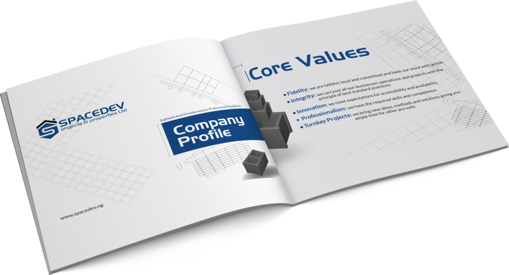
Create a brand visual identity system capable of immediately signaling trust and institutional readiness.
0.2
Strategic Diagnosis
Unlike many engagements, this was not a case of strategic confusion.
The leadership team came to Routput with unusual clarity.
They understood where the business was headed, what market they wanted to command, and what trust signals were required to get there.
Our role was to construct a credible expression.
0.3
ROUTPUT’s Intervention
ROUTPUT approached this engagement as a perception-scale project.
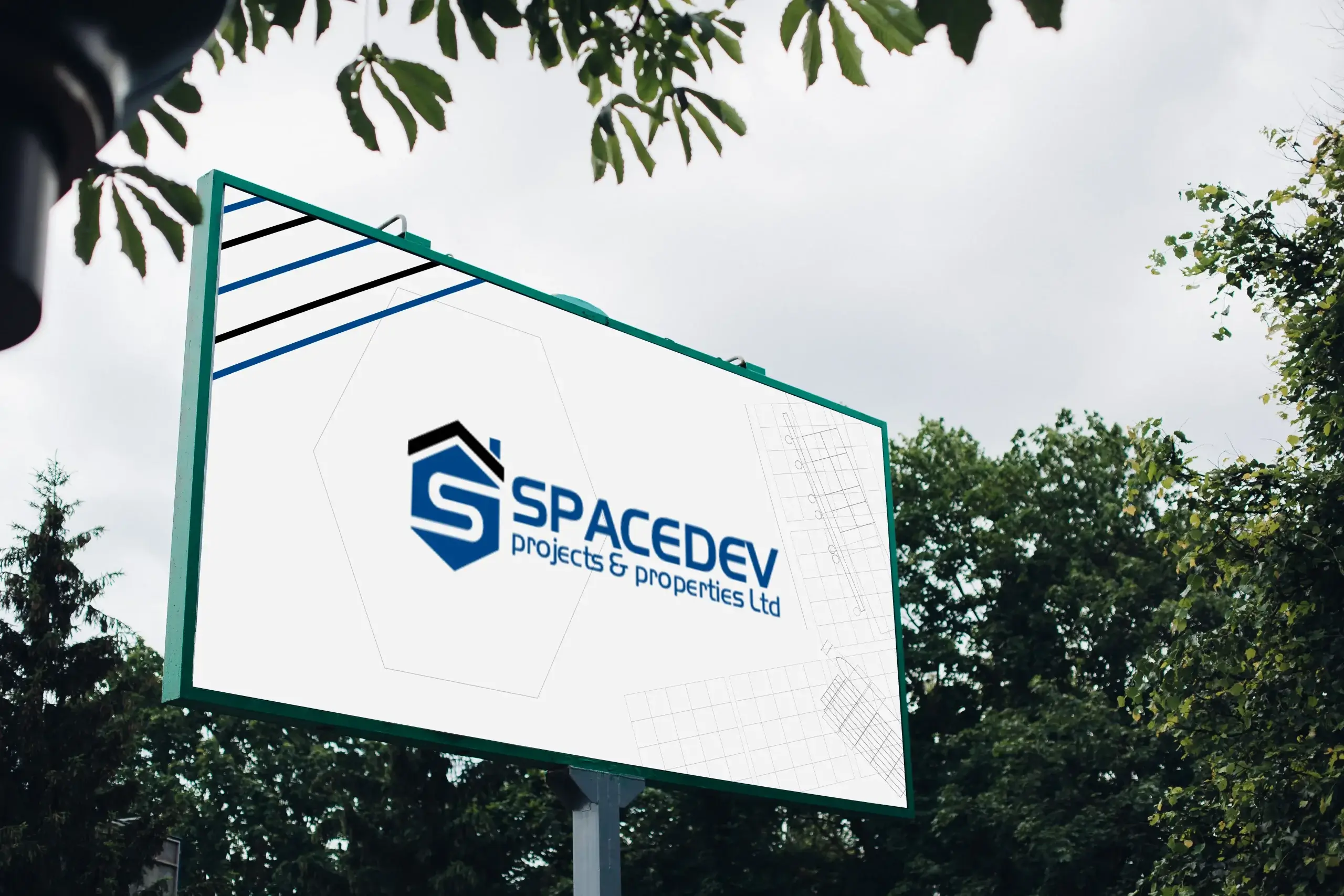
Rather than reinventing SPACEDEV’s positioning, we refined what was already strategically sound and then amplified it. This meant designing a full identity system capable of translating expertise into immediate authority. We focused on creating consistency across all visible brand expressions (digital, physical and verbal).
This included:
- Perception refinement for high-value institutional trust
- Identity system architecture for premium cohesion
- Messaging calibration for authority without unnecessary complexity
- Digital experience design aligned with technical sophistication
- Production management to ensure physical execution quality matched strategic intent
Our mantra was: No touchpojnt should dilute trust.
0.4
Execution Highlights
Identity Cohesion System
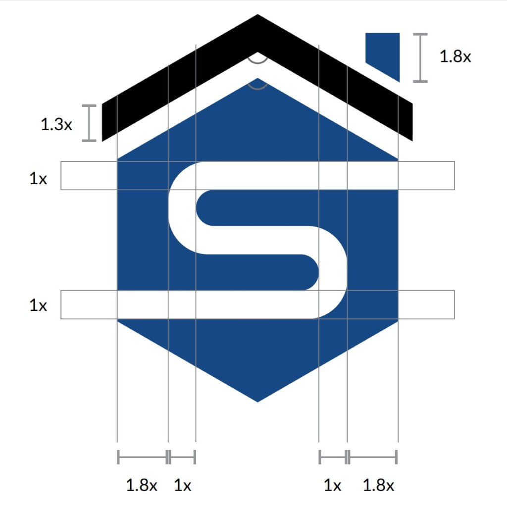
We developed a refined visual language designed for precision and credibility.
Typography, colour architecture, spacing logic, and structural consistency were calibrated to create a premium institutional presence across all touchpoints.
The result was an identity system that feels engineered rather than decorated.
Messaging & Verbal Authority
We refined brand language to reflect confidence, capability, and trustworthiness.
The communication system eliminates unnecessary noise and presents SpaceDev with the clarity expected of serious technical partners.
This improved both client-facing articulation and internal consistency.
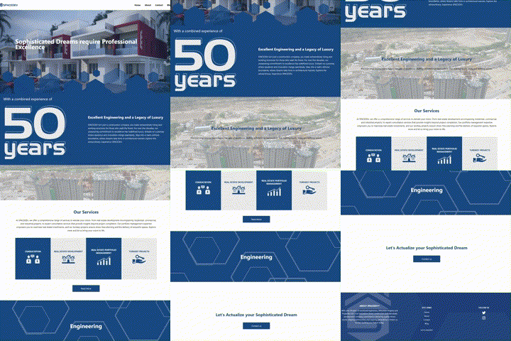
Website Experience
We designed and developed a digital presence that matched the calibre of the business itself.
The site was structured to communicate:
- Technical competence
- Operational reliability
- Strategic maturity
- Enterprise readiness
The result is a digital environment capable of supporting larger commercial conversations with confidence.
Long-Term Advisory Partnership
Our relationship extended beyond launch.
We remained available as a strategic partner for ongoing refinement, production, and asset creation, ensuring SPACEDEV’S brand continues to evolve in step with business growth.
This continuity protects consistency as new opportunities emerge.
0.5
Business Impact
SPACEDEV began looking like a competitor and no longer looks the “other option”. A company already operating at scale.
- True 360° Brand Cohesion
- Premium Institutional Presentation
- Improved Perceived Authority
- Memorable Presentation
- Execution Simplicity
- Confidence at Scale
“Over the years, ROUTPUT has consistently demonstrated exceptional responsiveness and reliability. They are always available, even on short notice, and approach every task with a strong sense of ownership. Working with them feels less like engaging an external consultant and more like collaborating with an integral part of our internal team. I will root for ROUTPUT any day any time”
– Abdulkadir Buhari
CEO, SPACEDEV
Growth creates a dangerous gap. We’re the partners that make it easy.